


How to break through the design of the curviest coffee in the packaging industry!
In recent years, as a new track, the number of domestic coffee brands has increased sharply with the market demand. It is no exaggeration to say that coffee is almost the most "volume" category of all new consumer categories. At the same time, coffee culture has gradually penetrated all aspects of young people's daily life, which means that coffee is changing from a supporting role in scenes such as offices and CBDs to a consumer protagonist, and even becoming a window for consumers to express their personality and self.
The identity of the coffee role has changed, and various coffee brands have begun to pay more and more attention to visual image. A complete visual system may "circle" some young consumers, but they still need large and small touch points to perceive the spirit and concept of the brand connotation, and then decide whether to continue to choose this brand. Coffee packaging not only has certain requirements for aesthetics, but also requires certain standards in storage, preservation and other functions. Therefore, in addition to creating a fresh visual experience, the innovation of coffee product packaging design is one of the keys to brand breakthrough.
YPAK has collected and organized the graphic visuals and product packaging designs of 5 emerging coffee brands/products. These brand strategies have different focuses and present different styles and tones visually. Let us feel the diversity of coffee visual scenes together.
•1.AOKKA
——A diversified coffee brand that incorporates outdoor elements
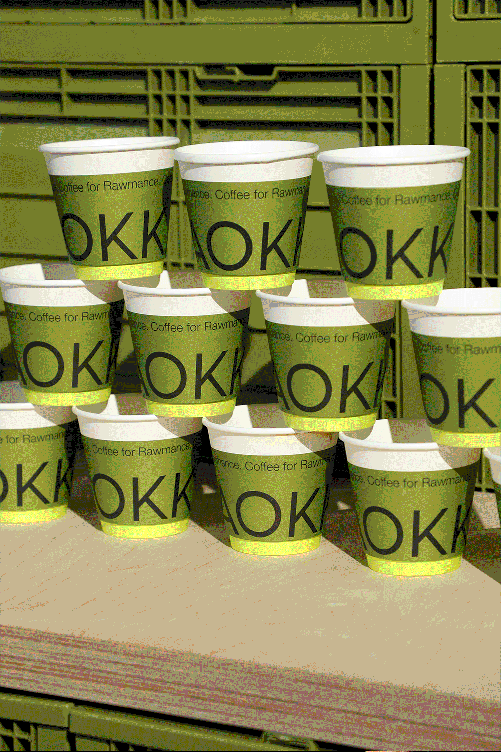
AOKKA brand manager Robin is a practical person who loves coffee, outdoor activities and record keeping. In response to the manager's pursuit and attitude, AOKKA is endowed with the brand spirit of "independence and freedom" and the brand concept of "wilderness club". The designer amplified this feature and refined and summarized elements such as wilderness, road signposts, tents, and horizon, and transformed this concept into an auxiliary LOGO.
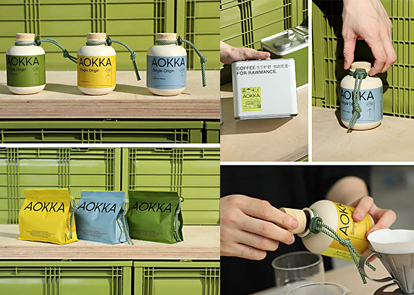
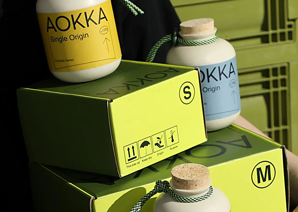
In terms of product design and packaging vision, AOKKA also follows this brand concept. The main colors of the brand are green and fluorescent yellow. Green belongs to the color of the wilderness; the fluorescent yellow is inspired by the logo of outdoor products and transportation safety. The product packaging is inspired by outdoor functional objects. The classic coffee bean can uses corks; the coffee bean bag uses outdoor umbrella ropes, fresh-locking self-sealing strips, etc.; the Italian iron tinplate can bean can borrows the shape of the energy reserve barrel and has a very strong outdoor attribute.
The coffee cup is the soul of a coffee shop. As one of the brand's visual elements, the design team continued this concept into the design of the coffee cup, implying that every cup of coffee has a label.
•2.Aroma coffee
——An independent coffee brand that focuses on "smell first"
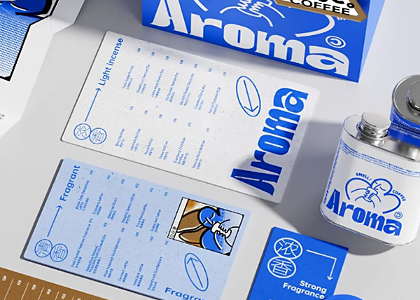
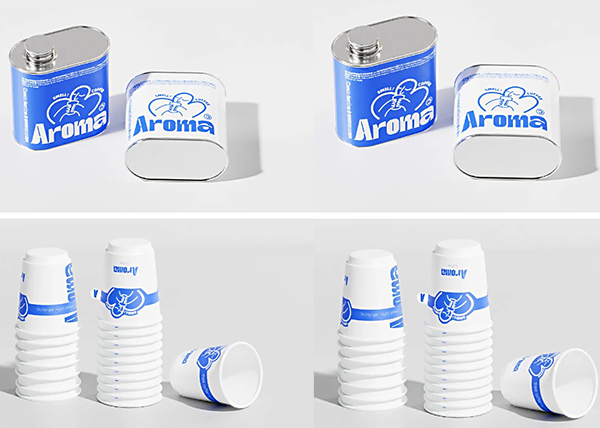
Aroma is an independent coffee brand from Suzhou, China, which aims to convey the concept of "meeting coffee with smell" to consumers. In order to distinguish itself from many coffee brands on the market, Aroma takes "smell first" as its purpose and emphasizes the diversified experience of coffee. Therefore, in terms of visual presentation, the design team developed associations around the three keywords "smell, sensibility, and smell", combined with product types, and divided the aroma of coffee into four levels for visual design.
•3.BREAD&PEACE
——Blue is the brand’s spiritual expression and also the pursuit of coffee “utopia”
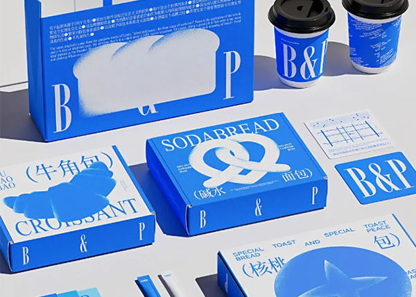
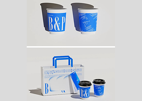
The brand name BREAD&PEACE comes from the Complete Works of Lenin. In the book, "bread" and "peace" are the first steps to socialism, symbolizing an ideal and pursuit of realizing socialism, which is also the owner's expectation of running a good store. In terms of design, the brand design of Beyond Imagination breaks away from the conventional baking and coffee brand style, and uses bright and highly saturated blue as the main color, giving people a deep visual experience of tranquility and harmony.
•4.Coffeeology
——Symbolize "coffeeology", simple yet lively
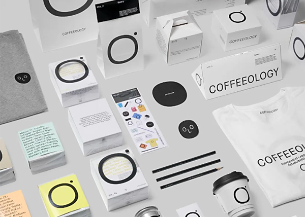
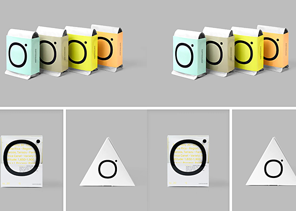
As a new coffee roasting chain in Guangzhou, Coffeeology specializes in selecting and testing exquisite coffee and ingredients for Guangzhou coffee lovers. The Coffeeology logo is transformed from the shape of a coffee cup looking down, which amplifies the connection between customers and the brand, combined with vivid and bold colors. The English word "OLO" is selected in COFFEEOLOGY as a distinctive image IP.
•5.COLON COFFEE ROASTERS
——Coffee bean packaging with "moment" as the visual center
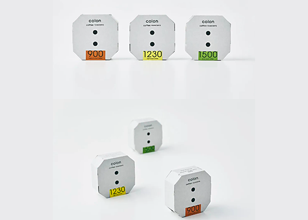
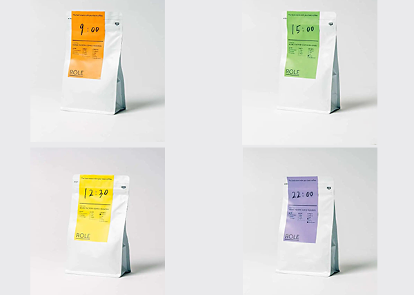
The name "colon coffee roasters" comes from the "colon" symbol used to display time. Just as the brand's user positioning, this is a coffee brand born for office workers, that is, according to the "drinking time" that suits the consumer's work style and lifestyle, choose the right coffee beans.
"colon coffee roasters" has four classic packaging styles. "9:00" means balance and eternity, suitable for breakfast; "12:30" is a refreshing flavor with high caffeine content, suitable for afternoon drinking; "15:00" is suitable for pairing with sweets and milk to relieve mental fatigue; "22:00" is a decaffeinated version, which can help you fall asleep peacefully before bed.
Post time: Jul-26-2024


